

Zsidily Studio
Surgical precision in digital product development. We craft experiences that function with absolute clarity.
Abstract Portfolio
A selection of conceptual frameworks and modular interfaces developed at Zsidily Studio. Each piece represents a distilled workflow.
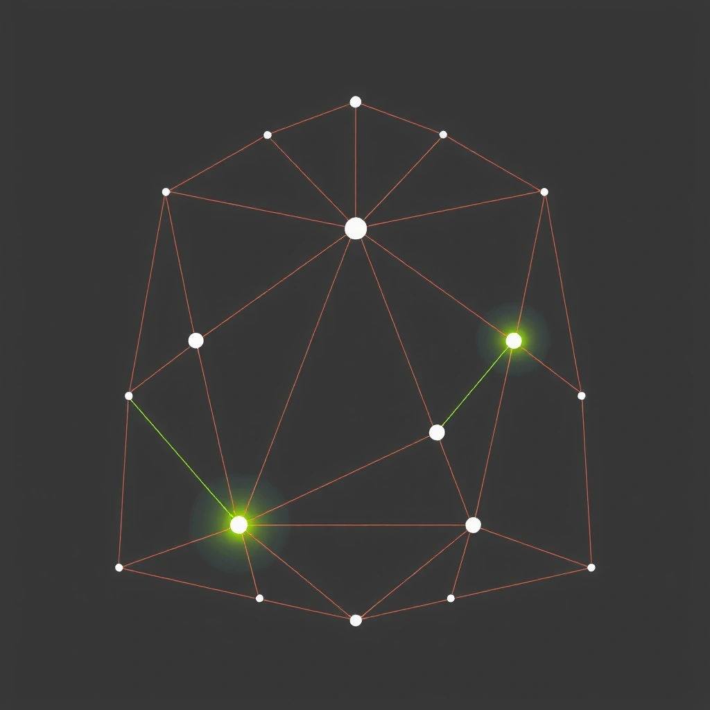
Nexus Protocol
Modular data visualization engine.

Candle Stack
High-frequency trading interface mockup.

Grid Zero
Architectural layout system.
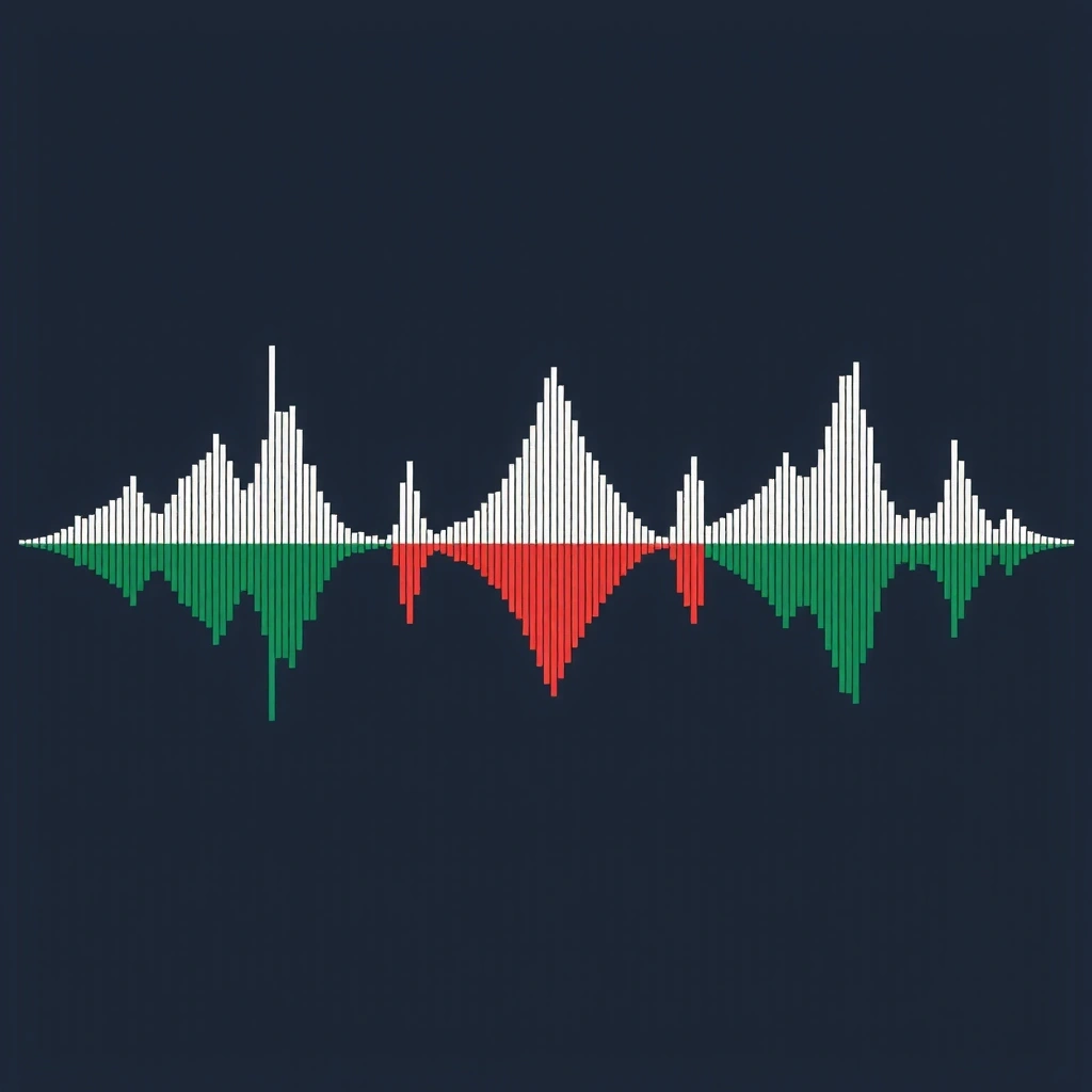
Pulse Array
Real-time audio processing UI.

Depth Layer
Z-axis interface management.
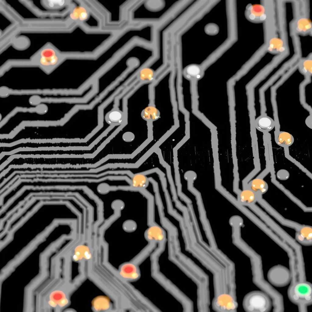
Trace Logic
Hardware abstraction layer.
The Development Protocol
Our methodology removes ambiguity from the development cycle. We begin with a forensic audit of requirements, stripping away non-essential features to expose the core function. Every line of code serves a specific, measurable purpose.
Prototyping occurs in isolated environments where stress testing is continuous. We simulate high-load scenarios and edge cases to ensure stability under pressure. The final product is not just functional—it is resilient.
Deployment follows a strict review process. No element goes live without passing our precision benchmarks. This ensures that what reaches production is exactly what was specified: clean, efficient, and exact.
Execution Framework
- ▸ Requirement Mapping: Define core metrics and success states.
- ▸ Isolated Prototyping: Build in void environments, zero distraction.
- ▸ Stress Iteration: Break the build, fix the break, repeat.
- ▸ Precision Deployment: Surgical release to production.
Zsidily Studio Field Guide
01. The Principle of Signal Clarity
In digital architecture, noise is the enemy. Signal clarity is the practice of ensuring that every user interaction produces a distinct, predictable outcome. At Zsidily Studio, we design interfaces where the signal-to-noise ratio is maximized. This means removing decorative elements that do not contribute to function and ensuring that every button, link, or form input has a singular purpose.
When a user engages with a Zsidily product, there is no confusion about the next step. The interface does not ask questions; it provides pathways. This is achieved through strict adherence to semantic HTML, high-contrast visual cues, and predictable interaction patterns. The result is a digital environment that feels like a laboratory: precise, cold, and effective.
Decision Criteria for Interface Design
- Latency vs. Feedback: If an action takes longer than 100ms, immediate visual feedback is mandatory. A button must change state instantly, even if the backend takes time.
- Contrast Thresholds: All text must meet WCAG AA standards (4.5:1). In our void-black theme, this means only high-luminance colors (lime-400, red-500, white) are used for primary information.
- Modularity: Components must be portable. A form field built for one module must function identically in another without CSS overrides or JavaScript hacks.
- Statelessness: Prefer stateless interactions where possible. If state is required, it must be managed globally and reactively, not in local DOM queries.
Myth:
"Good design must be visually complex to impress users."
Fact:
Complexity creates friction. Users trust simplicity because it signals confidence in the underlying technology. Decoration is often a mask for poor architecture.
Mini-Glossary
Common Development Mistakes
- Over-engineering forms: Adding validation logic that could be handled by HTML5 input types (date, email, number).
- Weak contrast: Using gray text on gray backgrounds to "soften" the UI, sacrificing readability.
- Ambiguous labels: Using "Click Here" instead of "Submit Application" or "Download Report".
- Inline styling: Breaking the utility-first architecture by injecting ad-hoc styles.
- State hoisting: Storing data in the DOM rather than a central state manager, leading to sync issues.
In a landscape dominated by noise, Zsidily Studio stands as a pillar of structural integrity. We do not chase trends; we define the parameters within which others operate. Our development philosophy is rooted in the belief that software should be silent, invisible, and flawlessly functional. The visual layer is merely a projection of the logic beneath.
- Zero-dependency architecture
- Atomic deployment units
- Predictive state management

Signals of Trust & Quality
Every tag serves a purpose.
Touch to visual feedback loop.
Guaranteed readability.
"We replaced a legacy dashboard with a Zsidily prototype. The reduction in cognitive load was immediate. Operators could identify anomalies in under 3 seconds. It's not just code; it's cognitive engineering."
"The 'void canvas' approach stripped away our bad habits. We finally realized that our users didn't need more features—they needed clearer pathways to the existing ones."
Start a Precision Project
Ready to strip away the noise?